Role
Strategy, Information Architecture, & Visual Design
Program
School of Visual Concepts - Visual Design for UX
Timeline
5 weeks, part-time
Prompt
Redesign the website of 1 of 3 local PNW companies: Fremont Brewing, Salt & Straw, or Top Pot
Main Considerations
Company's personality
Ways to improve upon their site's Information Architecture
The Challenge
Provide beer enthusiasts with a quick and easy path to the desired information while maintaining Fremont Brewing's fun and quirky personality that's true to their brand.
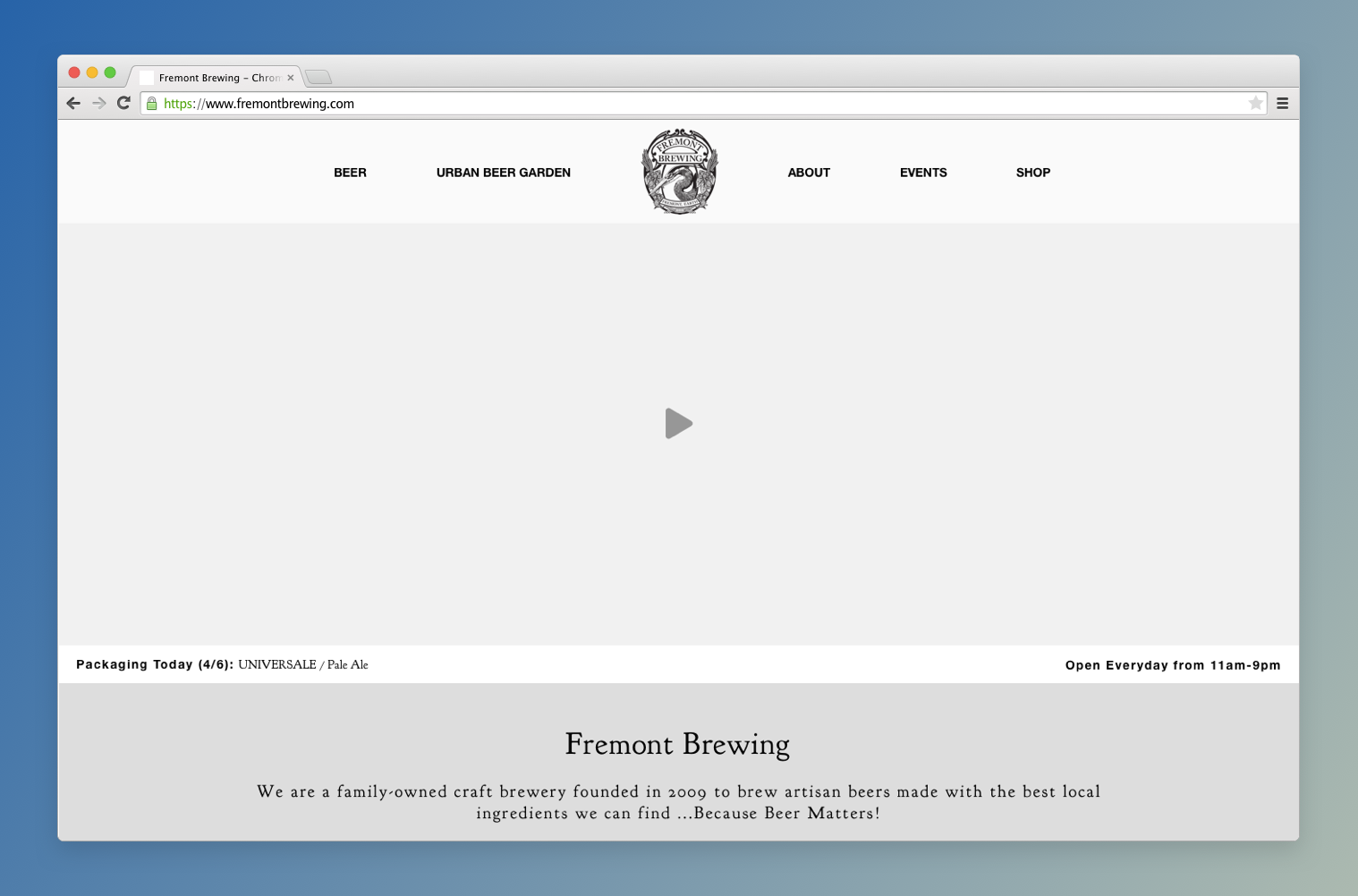
fremontbrewing.com is a simple website that houses over 25 informational pages about their company, their product, and their mission. They have a separate site for e-commerce and don't offer much in the way of online interaction for the user. Most of the pages are linked out from the site's primary & secondary navigation menus in the header.
Reduce the number of links in the header navigation structure and architect the homepage to provide snapshots of the most vital pieces of information at a quick glance.
Why?
Lessen the chance of overwhelming the user with too many choices, and provide them with a more efficient path to the information.
Assumptions
This project did not go into user interviews or usability testing and thus I made the assumption that the current navigation system is overwhelming and hard to use based on the number of links available.
With a longer timeline, I would opt to do testing on their current website to take a deeper dive into why users visit the site, where their pain points are with the current site and what they're truly looking for upon arrival.
Competitive Analysis
I performed a quick manual audit on a few competitor's websites to determine commonalities in data and layout.
The following were details that were repeated and easily accessible on competitor's websites.
Beer on Tap
Location(s)
Keg Details
Beers To Go
Brand Personality
I love the way Fremont Brewing conveys their personality through copy on their website. They are funny and no bullshit, but also very welcoming. You get a sense from reading through the content that they want everyone to come join them for a beer.
Recommendation
Continue to portray this in the redesigned site, while also bringing this personality out in the visual elements.
Ideation & Design Iterations
Mood Board(s)
A learning experience
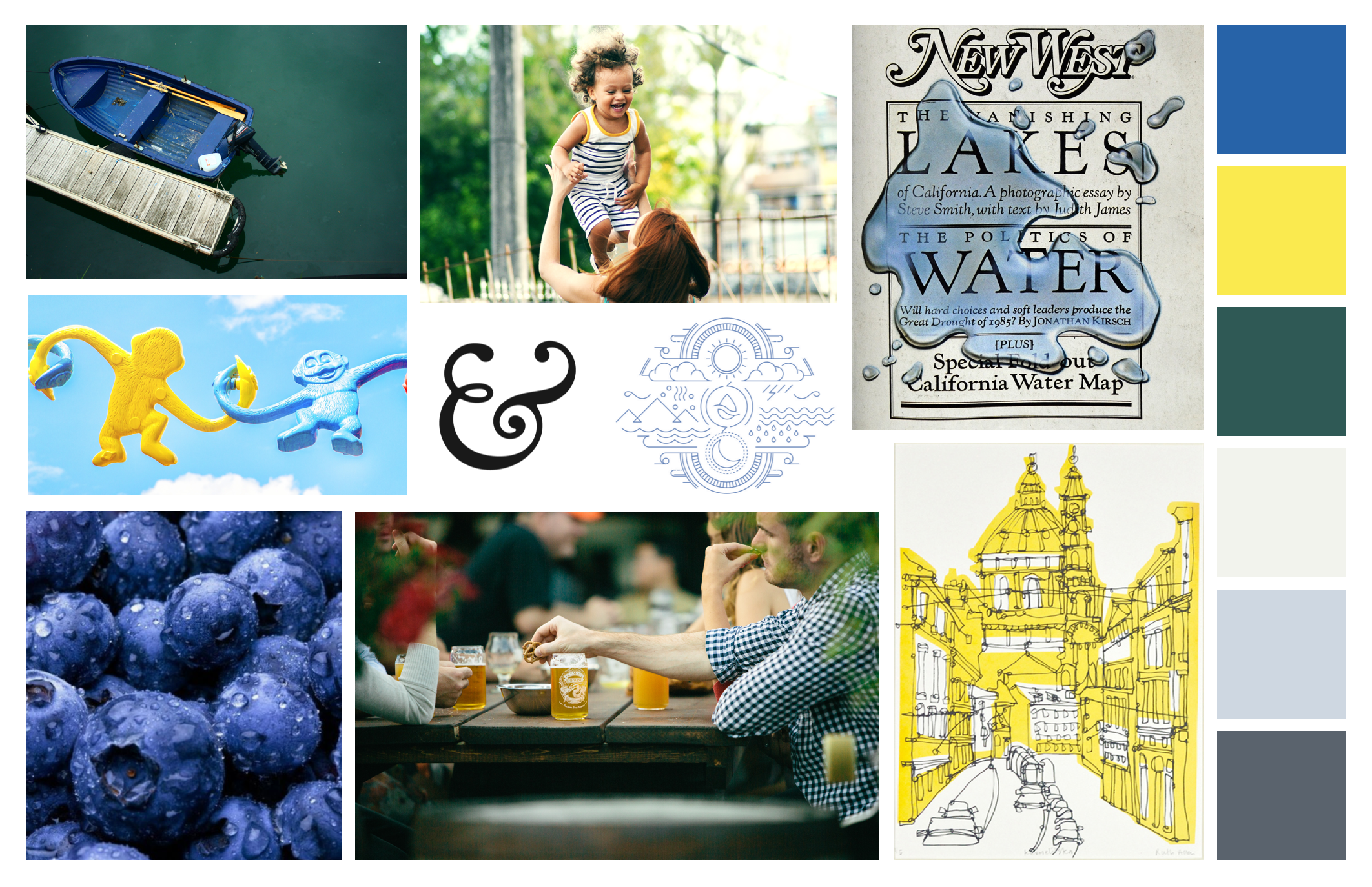
My first attempt at a mood board was less than stellar. Coming from a technical background, I ended up creating a style tile, which can be seen below. Based upon the feedback I received, I adjusted my approach and for my second attempt I created a more traditional mood board.
I revised the color scheme because I realized we didn't need to stick to the client's original color scheme and I wanted to provide them with a slightly more sophisticated palette.
Moodboard - Initial Attempt
Moodboard - Final Attempt
Wireframes
Initial Iteration
For the first round of wireframes we were tasked with creating 2 different concepts.
Concept #1: Modern look and feel, widescreen silent video
Concept #2: teaser cards provide snapshots of data, logo as backdrop
Class Feedback
"Concept #2 would be more interesting and fun"
"Consider how the hover states are going to look on mobile"
"Consider using the background logo image as a loader that fades into the background"
Second Iterations
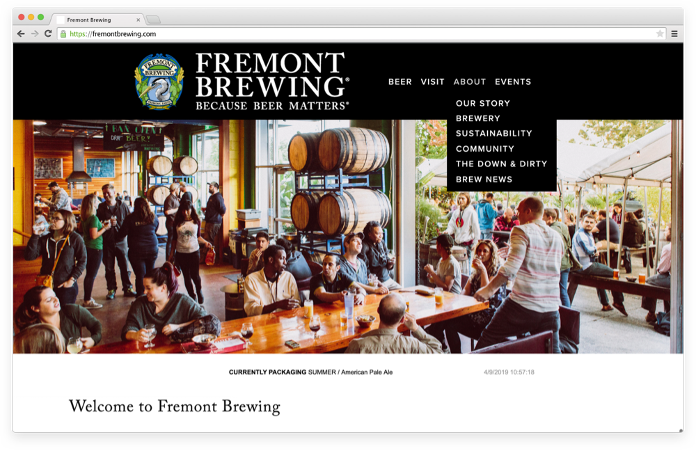
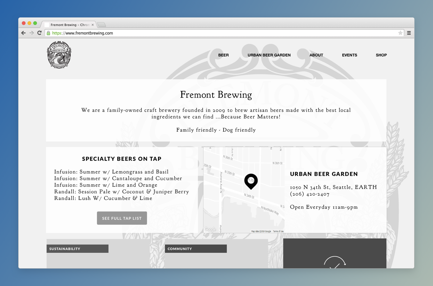
I decided the navigation links should always be available on desktop and not hidden under a hamburger menu because space allowed for it on the larger devices and because they don't have an overly complicated navigation system which needs another solution. This will allow the user one less click to get to a page they desire
I adjusted the layout slightly to incorporate interactivity effects, such as hovers, and attempt to paint a better picture of the full experience
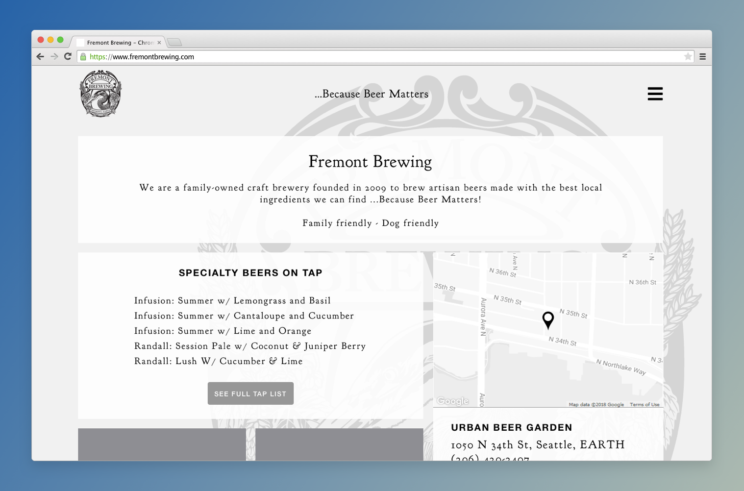
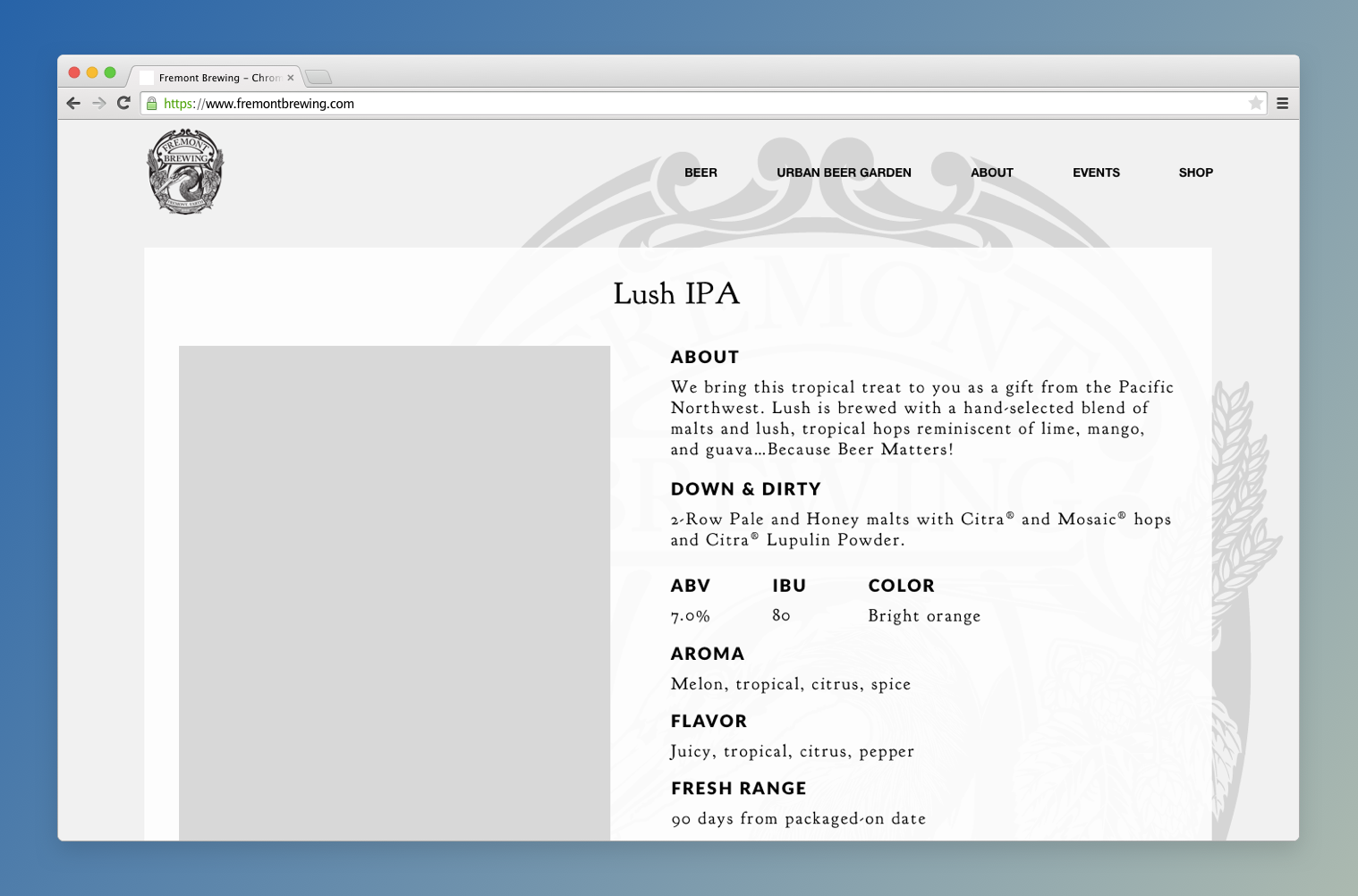
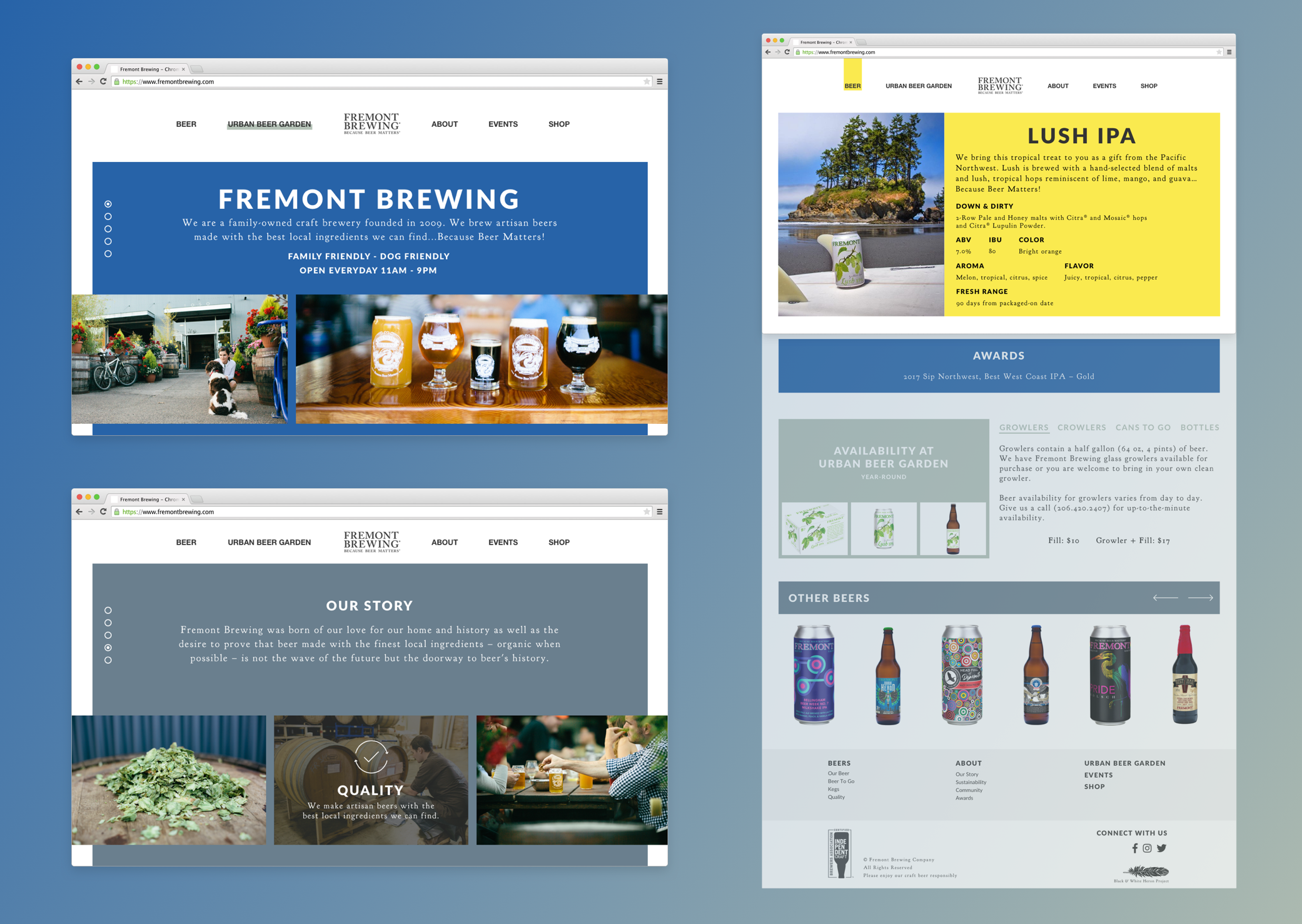
I added a secondary page layout for the beer details to show an additional layout style. This layout incorporates the information currently found on their website but in a more hierarchical and palatable layout
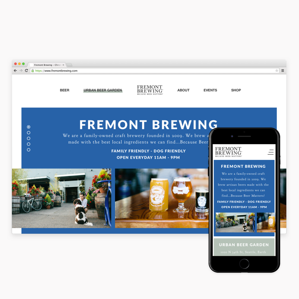
Homepage
Beer Details
Visual Design
My primary goal when starting work on the visual designs was to tell the story of the interactions on the homepage. My intention is for the homepage to be scroll jacked and for each content section to take over the height of the screen. To show this in a static visual, I created a separate mock for each section with the carousel indicators on the left displaying the correctly selected icon.
From the wireframes, I kept the approach that each section would only provide 'teaser' information. This helps organize the site without overloading the main navigation. It also helps the user easily identify the information they are seeking and navigate to their final destination with ease.
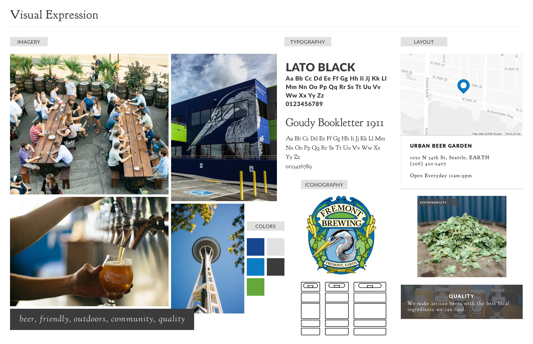
I chose a colorful palette that utilizes the tones of their former logo but adds a bit more sophistication to their pages. This palette stays true to their brand and personality with vibrant yellows and blues but is balanced out by the darker pastel green and slate gray to help portray a seasoned company.
I opted to use their slim horizontal logo in the header to save some page real estate and have thought about incorporating the larger heron logo on a loading or age verification screen instead.
I chose a san serif typeface for the headers that is playful and modern and paired it with a more traditional serif typeface to tie everything back to their logo and personality.
All secondary pages will utilize the original browser scroll so as not to be too frustrating to their users. I keeps the layout grounded to the homepage by bringing the color blocks back in to break up each section. I use bold headers to help guide the eye around the page so users knew exactly where to look to find the information they were seeking.
Visual Designs
Reflections
In Conclusion
Fremont Brewing is such an iconic part of Seattle's beer history and I wanted their website to stand out as much as they do as a brewery. I wanted to provide them with something fun and something quirky, but also something sophisticated. While they play the fun, quirky, welcoming card really well (and it's something we Seattleites know and love about them), this tends to play down the level of craft they put into each beer they make. They are well regarded in the beer community and toning down some of their original shades and using a nice traditional serif for their main text brings in a level of sophistication back into the site.
Rethinking the flow of the site is something that will make the biggest impact. Their current navigation system is overwhelming and with a little restructuring we can ease some of the anxiety a user might face when trying to figure out what they should click on to find the information they're really after.
Struggles
I struggled a lot with this color palette. My personal style leans quite neutral or mostly neutral with a pop of color, so working with an overly colorful palette was a challenge. I had a hard time visualizing the end result and ended up needing to make some adjustments between the wireframe phase and visual design phase because my original ideas and designs worked better for a more neutral palette with occasional pops of color.
I also struggled to distance myself from my technical background. My first attempt at a mood board ended up being more of a style tile because I approached it from a technical viewpoint. I dove head first into choosing fonts and icon sets because that's what I'm familiar with. After feedback from the class I really had to take a step back and try to see this portion of the project from a more abstract viewpoint. I found out that I really liked it and was more pleased with my second attempt than my first.
What I'd Do Differently
With a longer timeline and more resources, I would have preferred to do some usability testing on their current site and really dive deep into the nitty gritty of their user's actions. I made quite a few assumptions about why users go to their site based on popular approaches in the industry and that doesn't quite sit well with me.
There is a lot of information that is, clearly, important to their stakeholders, but likely not as important to the masses, and as such, we wouldn't want to put focus on those areas. Figuring out the main needs of their users would make all the difference in understanding the best flow for their site.