Heather Larsen

Team Lead for Design Systems & DesignOps at Fiserv

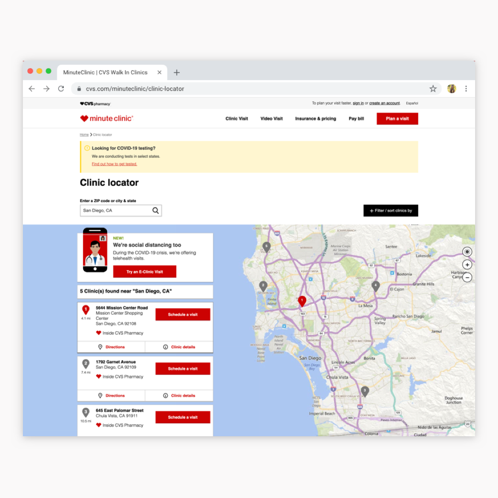
MinuteClinic Locator

Client Project

Role UX Design & Prototyping

Client CVS

MinuteClinic Team James Dyson - UX Researcher
Chris Gioranino - UX Designer
Elizabth Whittemore - UX Digital Producer
Jessica Toussaint - Product Manager

Rio SEO Team Penny Phaneuf - Project Manager
Jim Gassmann - Front-End Developer
Heather Larsen - UX Designer

Scope Redesign MinuteClinic's most visited webpages, the locator and the clinic details pages

Considerations MinuteClinic's design system, business requirements, and prior research
WCAG 2.0 Level AA compliance

View live site

User Stories

Randy

Randy, a 33 year old trucker, recently learned that his company is requiring him to get a DOT Physical. He checks the MinuteClinic website and sees that they're open for another 40 minutes. When he gets there he's turned away and told to make an appointment for tomorrow. Randy is frustrated he can't be seen when the provider is on duty and there is no one in the queue.

Suzie

Suzie is a 28 year old single mother of a rambunctious 6 year old. Her daughter, Lauren, has spent the last 3 days fighting flu-like symptoms that are getting worse. She takes the day off work to take Lauren to the clinic and sees that the nearest MinuteClinic location has a wait time of 32 minutes. Suzie holds her place in line using the website's "Visit today" feature. They arrive at the clinic 10 minutes later, check in, and sit down in the waiting area. Suzie and her daughter wait for 45 minutes until she finds the provider and asks how much longer the wait will be. The provider tells Suzie there are 2 more people in line ahead of her. They wait another 30 minutes before being seen. Suzie's wait time at the clinic ended up being 43 minutes longer than the website's approximate wait time listed.

The Challenge

Effectively communicate when a user can go to a clinic and how long they should expect to wait

The Process

  • Discovery
  • Low Fidelity Designs
  • High Fidelity Designs
  • High Fidelity Prototyping
  • Usability Testing
  • High Fidelity Revisions

Discovery

current locator designs

Research Readout

Led by CVS's UX team

In October 2018, the CVS UX team performed usability testing on their previous locator website.

Sessions

10 virtual 30 minute sessions testing the locator and the clinic details page

Key Findings

  1. More interaction with the list than the map
  2. Insurance filter was not obvious
  3. Insurance and cost of services listed as "very important"
  4. Lack of "Open Now" feature
  5. Current hours format was well understood
  6. Posted hours and wait times can be incorrect leading to frustration in the clinic
  7. Missing a list of available services
  8. Expected a map view near the top of the clinic details page

Competitive Analysis

Before beginning on wireframes, I performed a competitive analysis and found that the majority of their competitors' websites emphasized scheduling over walk-ins, limited messaging, and used plain language. None of them communicated an approximate wait time.


Constraints

Vendor Requirements

We recieved a document including 20 vendor requirements for the redesign, which added to the 19 previous requirements we obtained after the client signed with Rio SEO.

Example Requirements

  1. Needs to show provider on duty
  2. Add additional filtering options
  3. Ability to sort by distance and wait time
  4. Needs to improve communication of Wait time to users (ie. How do we communicate wait time in a way that says the clinic is busy without providing an exact number?)
  5. Needs to improve display of temporary clinic closure (Full Day/Partial) and holiday messaging

Branding & Design System

The CVS team provided us with access to their Brand Center where we were able to collect and download UI Kits, icon guidelines, branding guidelines, etc. This allowed us to know what design limitations we were working within and what common design patterns looked like for the CVS team.


Alignment of Tools & Process Flow

  • Sketch
  • InVision
  • usertesting.com

Ideation & Design Iterations

Initial Ideas to Test

  1. Number of patients in line vs approximate wait time
  2. "Disabled" text in place of "missing" buttons in the result card
  3. Horizontal search bar with filtering options and 1 search feature instead of 2
  4. Addition of a browse path & SEO content block for improved SEO and link equity
  5. Change button text - move away from using "visit" in nearby buttons
  6. Slim hero banner to help orient the user and align with other site layouts
  7. Visual approach: simple & uncluttered

Rio SEO Low Fidelity Wireframes

low fidelity wireframes View all screens

Feedback from CVS Team

  1. Need to display the wait time
  2. Avoid tooltips
  3. Holiday Hours Treatment: think about combining into one view
  4. Add # of services to the Services header
  5. Don't want to include Geolocation on desktop - show "empty" state instead
  6. Like booking widget & visit length tool idea
  7. Will have to test button text changes

Rio SEO High Fidelity Mocks

rio seo high fidelity wireframes View all screens

CVS High Fidelity Mocks

cvs high fidelity wireframes View all screens


Usability Testing

Research Readout

Led by CVS's UX team

CVS's UX team provided us with their notes from the first round of usability tests.

Goals

  • Evaluate both versions of the redesign for the locator and the clinic details pages
  • Explore new approaches to communicating wait time and clinic availability
  • Solicit user feedback on various design approaches and feature enhancements

Methods

  • 9 total moderated remote tests via Usertesting.com
  • Each participant interacted with both designs
  • The order of design exposure alternated every session to reduce bias
  • Participants explored the designs, completed specific tasks, and provided general and detailed feedback

Participants

Participants between the ages of 18 and 65

Key Findings

Rio SEO

  1. Users were easily able to find the filters
  2. "Book appointment" and "Visit today" CTAs were problematic for most users
  3. Most users understood that actual holiday hours were being displayed
  4. Mobile: Users expected the large map view and liked the ability to click on each pin

CVS

  1. Most users preferred to see actual wait times
  2. Most users liked seeing how many people were in line
  3. Mobile: It was unclear to most users that they could swipe to see more results
  4. Text of this holiday hours treatment led users to expect to click on the text to view the actual hours
  5. Most users felt the quick-view offered them all the information they would need

Project Continuation

Overall users found the Rio SEO designs easy to use, but preferred the bright visual aspects of the CVS designs. As such, the CVS UX team worked through iterations on those designs internally and once finalized they provided them to the Rio SEO development team for implementation.

Shortly after the usability tests wrapped up, I moved on to a new role outside of Rio SEO and was unable to see this project through to launch.

Reflections

Challenges

As a 3rd party, there were a few challenges we faced when working through this project with the client, most of which were surrounding differences in procedures.

  • With the MinuteClinic Team leading the research for this project, we only received a small snapshot of the findings which made it challenging to understand the full extent of the problem.
  • We needed to work within the boundaries of MinuteClinic's existing design resources, but we couldn't always find what we needed and didn't have timely access to get them created.
  • Our accelerated timeline meant we were cramming months worth of work into a 2 week timeframe. Ideally, we would have had a bit more time to align on the problem, user pain points, and project goals before beginning design work.

In Conclusion

This project allowed me to work with a very talented UX team with the same end goal as my own; simplify the messaging and alleviate confusion for their users about when they can come in to a clinic. I'm proud of the process we worked through as a team and hope our blended ideas will serve the user well and that Rio SEO and CVS will continue to partner to improve this offering.